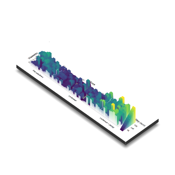
My year as a ‘activity landscape’
Context:
2020 was an strange year for everyone in many ways. For me, I saw a huge fluctuation in the amount of movement I did. Essentially, I went into work-from-home mode - work, eat, sleep, repeat - not a lot of walking. Then, I got a very energetic little puppy - lots of walking. I wanted to see if I could make a visualization that captured the huge difference in activity that I felt. Luckily, I’ve been wearing a smart watch the whole time. So I took the opportunity to grab my Google Fit data and get started.
1) Load packages
library(tidyverse) # data-wrangling## -- Attaching packages --------------------------------------- tidyverse 1.3.0 --## v ggplot2 3.3.2 v purrr 0.3.4
## v tibble 3.0.4 v dplyr 1.0.2
## v tidyr 1.1.2 v stringr 1.4.0
## v readr 1.4.0 v forcats 0.5.0## Warning: package 'tibble' was built under R version 4.0.3## Warning: package 'tidyr' was built under R version 4.0.3## Warning: package 'readr' was built under R version 4.0.3## Warning: package 'dplyr' was built under R version 4.0.3## -- Conflicts ------------------------------------------ tidyverse_conflicts() --
## x dplyr::filter() masks stats::filter()
## x dplyr::lag() masks stats::lag()library(lubridate) # working with dates##
## Attaching package: 'lubridate'## The following objects are masked from 'package:base':
##
## date, intersect, setdiff, unionlibrary(extrafont) # custom fonts for my visualization## Registering fonts with RLoad data
dat <- read_csv("C:/Users/Dial_/OneDrive - McMaster University/Code/~ main/DV - Data Visualization/fitness_landscape/raw_data/takeout_2020_11_13/Takeout/Fit/Daily Aggregations/Daily Summaries.csv")##
## -- Column specification --------------------------------------------------------
## cols(
## .default = col_double(),
## Date = col_date(format = "")
## )
## i Use `spec()` for the full column specifications.Some data cleaning
For those of you data lovers that haven’t downloaded your Google Fit data before - you should. There’s a lot in there. I only wanted data from this year, so I with the lubridate and dplyr packages I was quickly filter the dates and variables I wanted, and then parse out the aspects of the date info that I wanted.
dat_c <-
  dat %>%
  filter(Date > '2020-01-01') %>%
  select(Date, `Step count`) %>%
  mutate(
    wday = wday(Date),
    mday = mday(Date),
    week = week(Date),
    month = month(Date)
    )

days_of_week <- c("Mo", "Tu", "We", "Th", "Fr", "Sa", "Su") # pretty labels for ggplot
Plot
The basic idea was to create a heat map of days of the year, with the fill colour being my step count data.
p1 <-
  dat_c %>%
  ggplot(aes(x = week, y = wday, fill = `Step count`))+
  geom_tile()+
  geom_vline(xintercept = 12, color = "white")+
  geom_vline(xintercept = 37, color = "white")+
  geom_text(x = 6, y = -9, label = "Pre-lockdown")+
  geom_text(x = 24, y =-9, label = "Lockdown")+
  geom_text(x = 42, y = -9, label = "Lockdown + puppy")+
  scale_fill_viridis_c(breaks = c(5000, 10000, 15000), labels = c("5K", "10K", "15K"))+
  scale_x_continuous(position = "top", breaks = scales::pretty_breaks(), expand = c(0,0))+
  scale_y_reverse(breaks = c(1:7), labels = days_of_week)+
  labs(
    x = "Week",
    y = "  Weekday"
  )+
  theme(
    text = element_text(size = 14),
    axis.title.x.top = element_text(hjust = 0.5)
  )+
  coord_equal(clip = "off")

p1
Pretty cool! This is pretty close to what I was after. However, I had recently taken note of this awesome package rayshader that can take ggplots and make them into 3D rayshaded images with some really cool results. So, why have 2D, when you can have 3D?
3D plot
With just a few lines, you can turn a ggplot into something three-dimensional. By default, this will open up an interactive window where you can drag and orbit around the plot that you’ve made.
library(rayshader)## Warning: package 'rayshader' was built under R version 4.0.3library(rayrender)## Warning: package 'rayrender' was built under R version 4.0.3##
## Attaching package: 'rayrender'## The following object is masked from 'package:ggplot2':
##
## arrowlibrary(av)## Warning: package 'av' was built under R version 4.0.3plot_gg(
p1,
width = 10,
height = 3,
height_aes = "fill",
scale = 400,
sunangle = 135,
multicore = TRUE,
shadow_intensity = 0.6,
raytrace = F,
preview = F,
pointcontract = 1
)## Warning: Removed 1 rows containing missing values (geom_segment).## Warning: Removed 1 rows containing missing values (geom_segment).render_snapshot("step_plot.png")
If we want to save the result, we can do so as a static image of the plot, or in my case, I wanted to play around with the ability to make it a movie. Because why have 2D when you can have 3D 4D? In my example I set up a couple vectors to customize the camera position, based on the package author’s original tutorial on the topic.
# Set up the camera position and angle
phivechalf = 30 + 60 * 1/(1 + exp(seq(-7, 20, length.out = 360)/2))
phivecfull = c(phivechalf, rev(phivechalf))
thetavec = 0 + 60 * sin(seq(0,719,length.out = 720) * pi/360)
zoomvec = 0.9 + 0.2 * 1/(1 + exp(seq(-5, 20, length.out = 360)))
zoomvecfull = c(zoomvec, rev(zoomvec))

# Render movie, custom
render_movie(filename = "step_plot.mp4", type = "custom",
            frames = 720, fps = 60, phi = phivecfull, zoom = zoomvecfull, theta = thetavec)
## [1] "C:\\Users\\Dial_\\OneDrive - McMaster University\\Code\\~ main\\DV - Data Visualization\\fitness_landscape\\analysis_fies\\step_plot.mp4"And there it is - the landscape of my year so far, in steps.